One Language, Many Surfaces
A design system for Simplifai's AI automation platform.
A design system for Simplifai's AI automation platform.
UI across the product wasn't consistent. Every team was building their own version of the same components, so buttons, spacing, and color drifted slightly depending on who built the screen.
We built the full system from day one, not a lighter version. Tokens, components, documentation, and governance together, built in parallel with Flow Builder so it got tested against real complexity as it went, not after the fact.
Teams stopped rebuilding the same components. Flow Builder's canvas ended up being the best proof the investment was worth it, the system had to hold up under a lot more than simple forms.
This is the design system behind Simplifai's AI automation platform. It's the same foundation that Flow Builder and the Human-in-the-Loop review workspace are built on, both covered elsewhere in this portfolio. Those two are about specific product decisions. This one is about the shared language underneath them, the tokens, components, and governance that let a small team keep shipping consistent, complex interfaces as the product kept growing.
Before the system existed, every team was solving the same UI problems on their own. A button in one part of the product didn't quite match the same button somewhere else. Every new feature usually meant rebuilding something that already existed, just slightly differently.
Build one system, tokens, components, documentation, and governance, rigorous enough for Flow Builder's canvas but flexible enough for everyday product screens, without it becoming a bottleneck.
Leadership and product pushed back early on. They wanted something lighter and faster to ship, fewer states, less documentation. Understandable, a lighter system gets into people's hands sooner.
The counterargument was Flow Builder. Its canvas needed node types with their own visual language, a variable selector that could filter by execution path, a toolbar with real state logic across editing, testing, and viewing, and zoom and pan controls nothing off-the-shelf could give us. A lightweight system would've hit a wall the moment that complexity showed up, and we'd have been rebuilding it anyway, just later and under more pressure. Pointing at Flow Builder's canvas as proof is what got the fuller investment approved.
From there the two were built in parallel, feeding each other. The general system got tested by everyday product screens, Flow Builder pushed it into harder problems, stateful toolbars, custom canvas tooling, deeply nested variable trees.
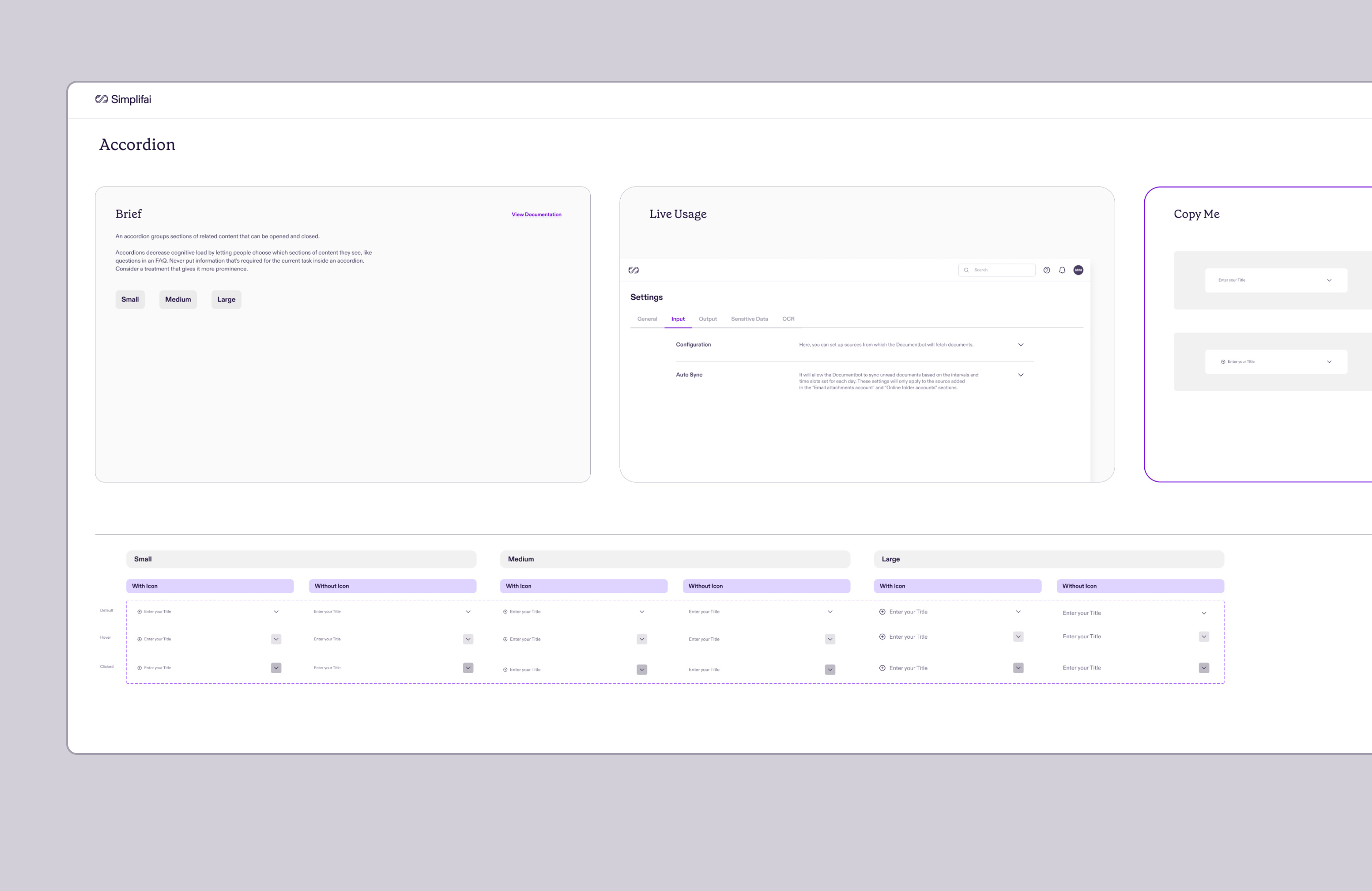
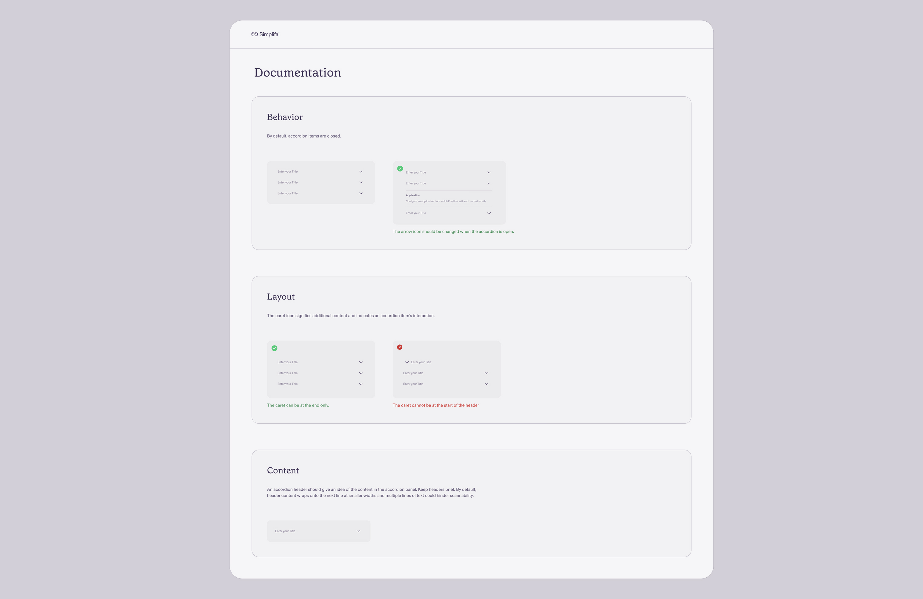
Every component follows the same documentation structure, simple or complex. A Brief explains what it is and when to use it. Live Usage shows it inside an actual product screen instead of floating in isolation. A Copy Me block gives engineers a ready-to-use instance they can drop straight in. Then a full states and variants matrix, then Behavior, Layout, and Content guidance with right and wrong examples side by side.
Accordion was one of the first components documented, and it shows the template well: small, medium, and large sizes, a live example pulled from a real settings screen, and layout rules that specify exactly where the expand caret can and can't go.
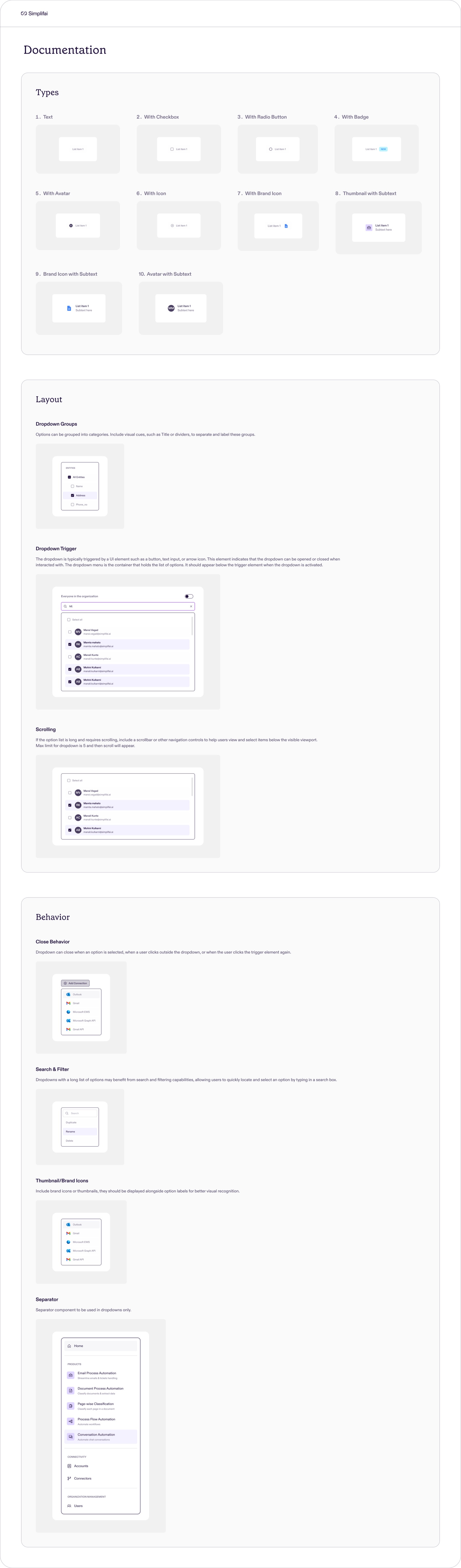
The same structure holds across the whole library, from something as simple as Badges and Chips up to Dropdowns, which alone covers ten distinct types and something like two dozen state variants.
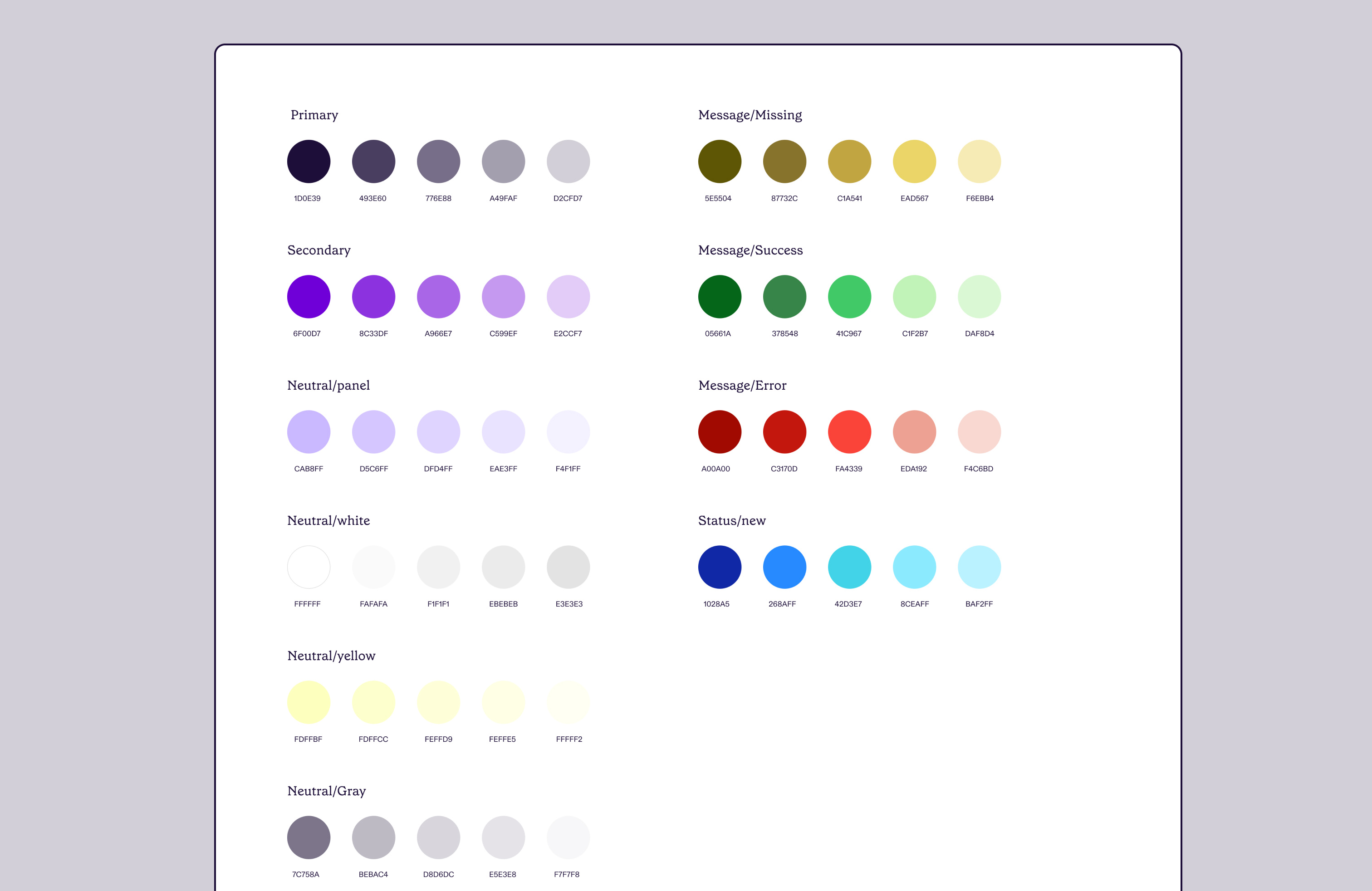
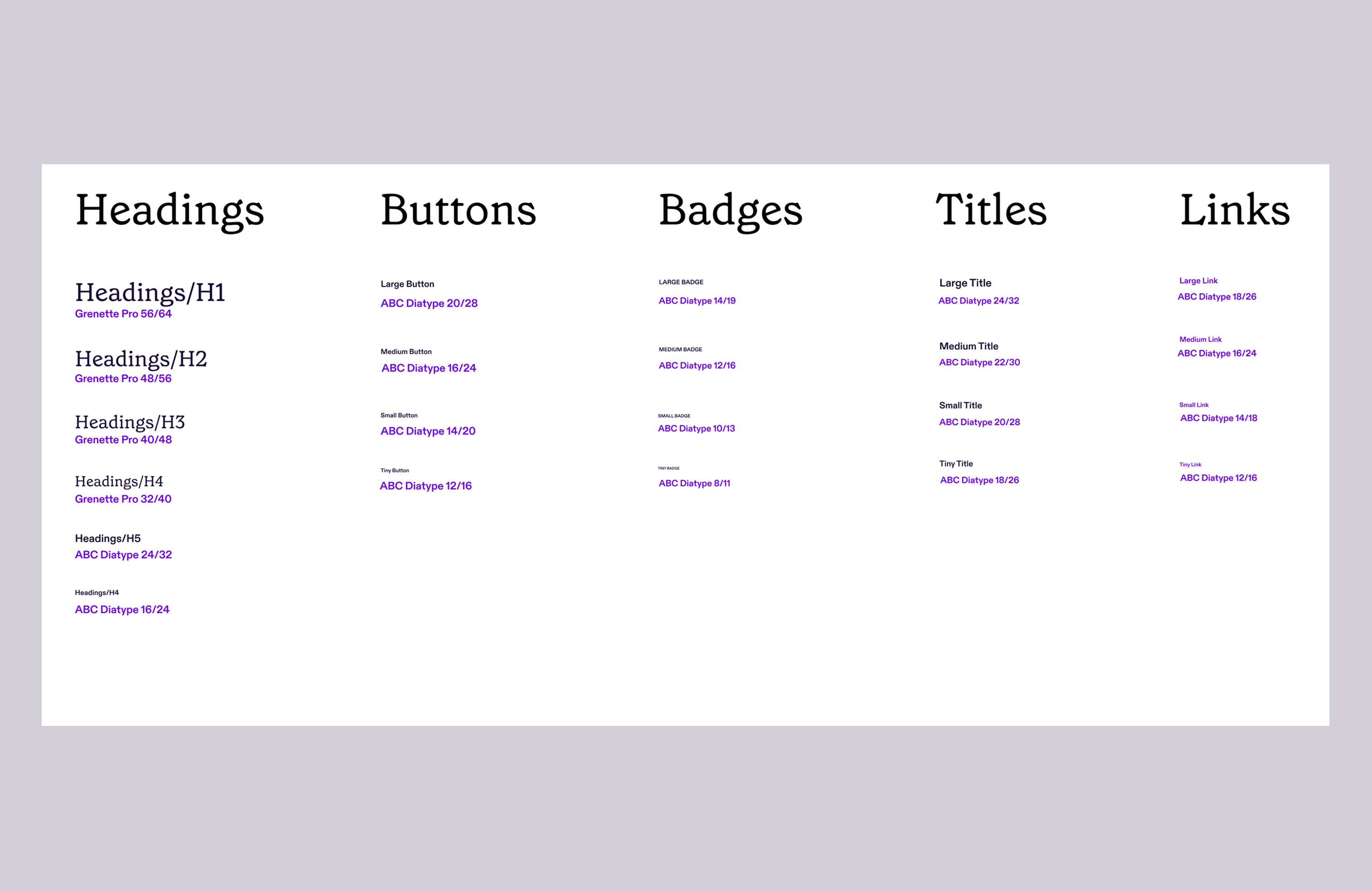
It starts with tokens: primary and secondary color scales, five separate neutral scales for panels, whites, yellows, and grays, plus a semantic set for missing, success, and error states. Typography pairs a serif display face for the big headings with one sans-serif carrying everything else, buttons, badges, titles, links, body copy, across four sizes and two weights. There's also a brand icon system for every third-party connector the product integrates with, Outlook, Salesforce, Zendesk, Dynamic 365, and so on, each at a ten-step size scale so they stay legible from a small dropdown row up to a full connector card.
The whole team had access to the Figma library, designers, engineers, PMs, everyone. Not just a few of us. That meant we needed a way to keep things consistent without gatekeeping who could touch it. Two things did most of the work: a strict component and variant structure that made it hard to build something inconsistent by accident, and a weekly design review where anything new or changed got checked against the standard before it merged.
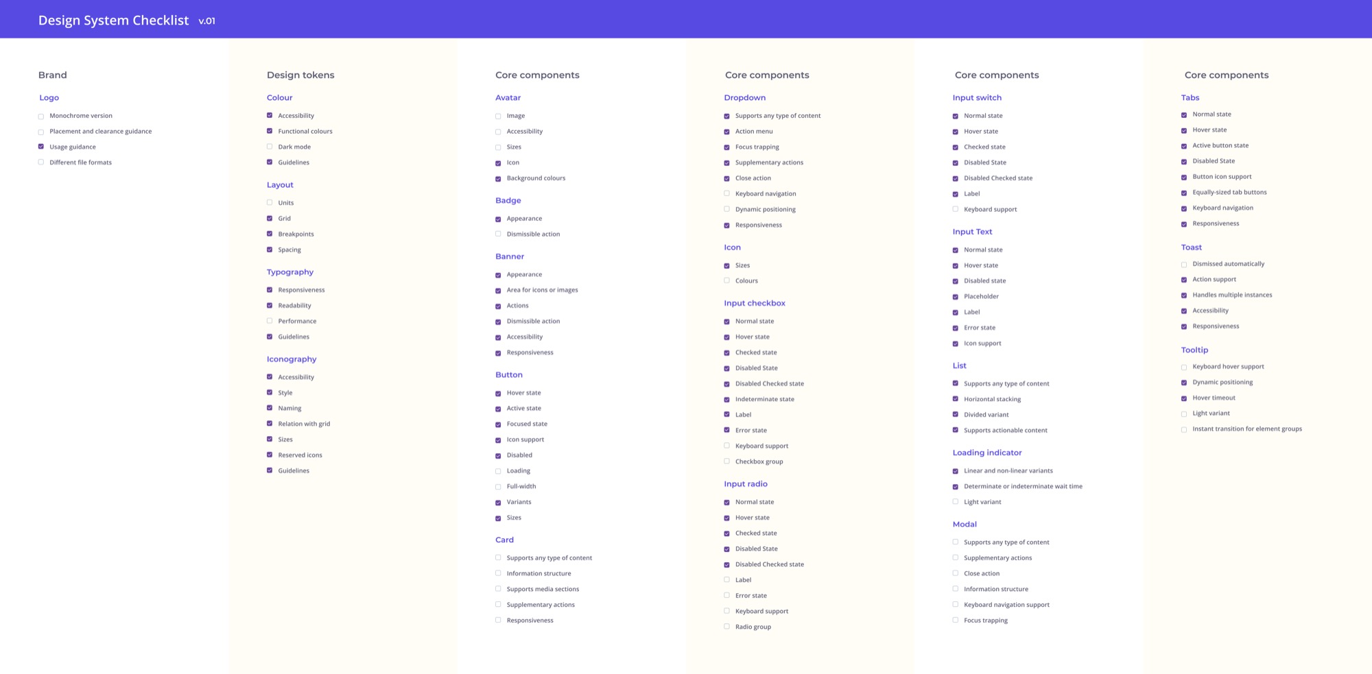
We also kept a running checklist of what had actually shipped for every foundational piece, down to individual states like hover, disabled, keyboard support, so gaps were visible instead of assumed.
On the engineering side, tokens got exported directly into CSS variables and JSON instead of being re-implemented by eye. That kept design and code from drifting apart as the system grew.
None of this holds up if nobody can tell what changed and why. So every version of the system got a dated changelog entry, what was new, what got updated, and a full table of every component that changed, old behavior next to new, plus a separate list of components added that version. When Avatar dropped its single-letter variant for a two-initial set, or Badge picked up four new states, that change was written down, not just quietly shipped. It's a small thing, but it's the difference between a system people trust and one they're always double-checking.
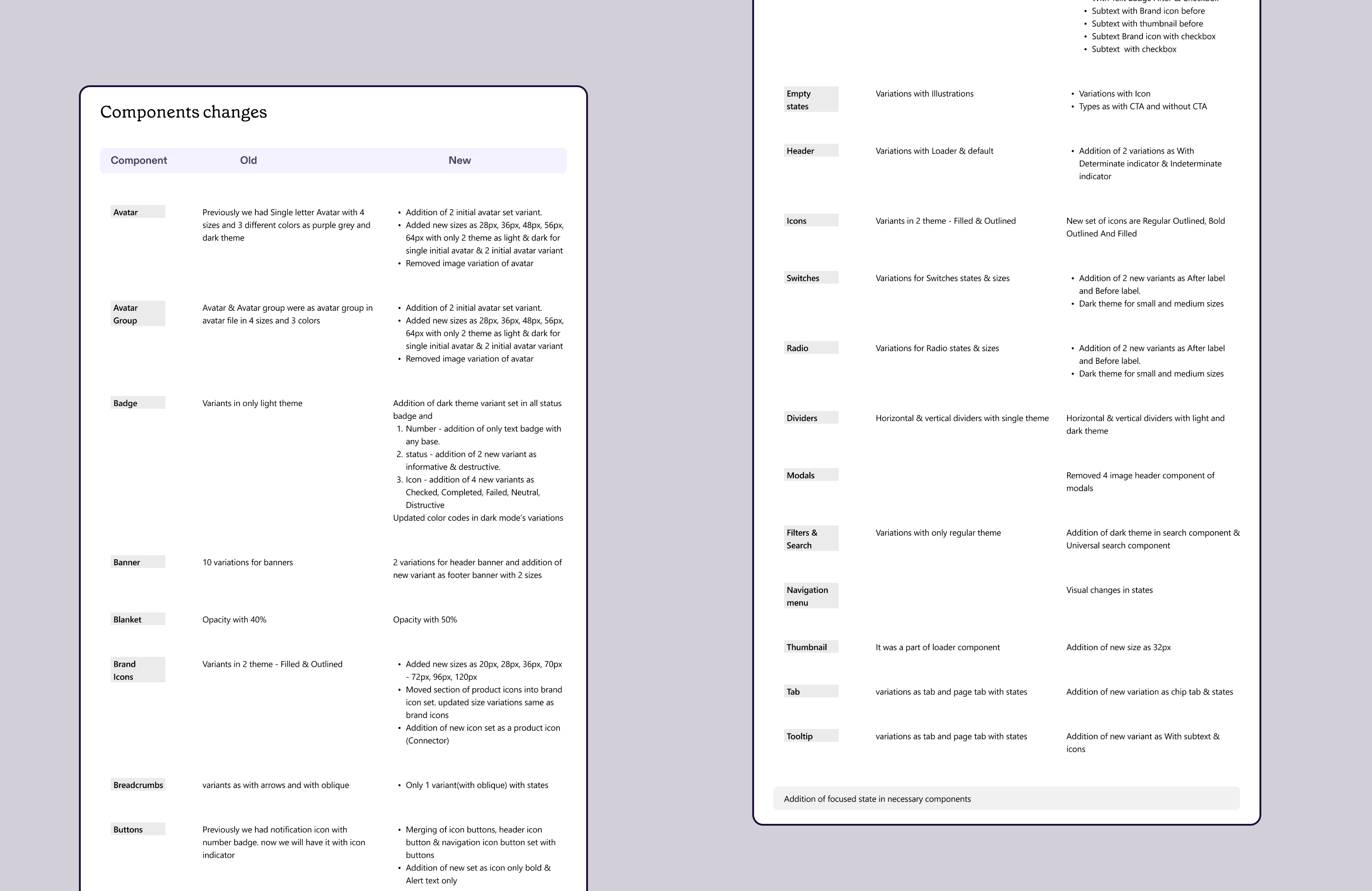
| Component | Old | New |
|---|---|---|
| Avatar | Single letter, 4 sizes, 3 colors | Two-initial variant, 5 sizes, light and dark theme |
| Badge | Light theme only | Dark theme across all variants, plus new status and icon states |
| Dropdowns | Image and other variants | 9 new variants, including subtext, brand icon, and checkbox combinations |
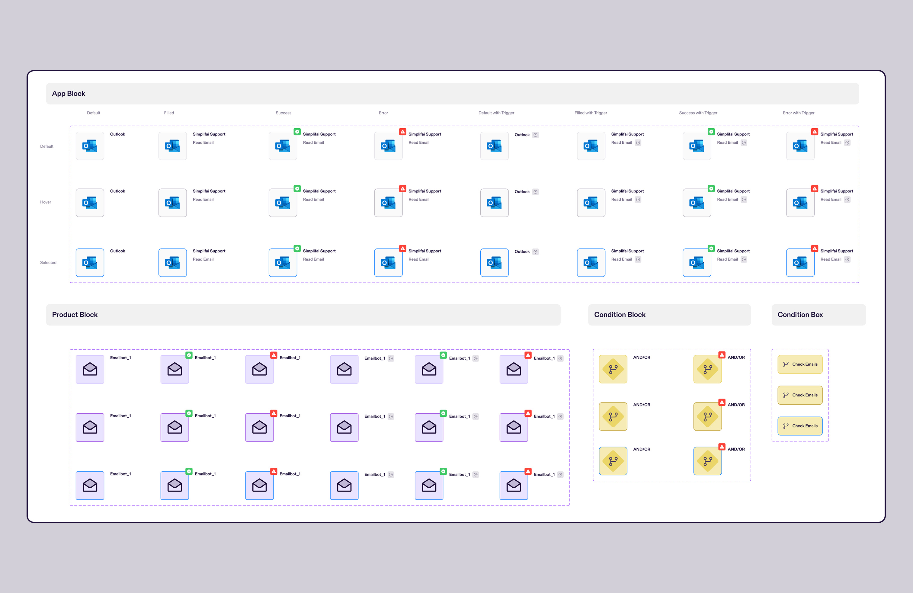
The clearest proof of this system's depth shows up in Flow Builder. The contextual variable selector from that case study, the nested tree that filters variables by execution path and cut selection errors by an estimated 40 percent, is built entirely out of this system's accordion and dropdown components. Same with the flow canvas itself: every node type Flow Builder needed, Apps, Logic, AI Skills, as its own visual language, is a documented component here, with its own default, filled, success, and error states across default, hover, and selected.
The Human-in-the-Loop review workspace pulls from the same foundation too, the list and table components structuring the claim review queue, the badges surfacing AI confidence scores.
The clearest outcome was speed. Teams stopped rebuilding the same components for every new feature, so new work shipped faster with a lot less custom engineering effort. That same reuse is what let the Flow Builder team spend their time on the actually hard problems, the canvas tooling, the toolbar state machine, instead of also having to invent basic forms and tables from scratch.